TOMMY MORONI E&M
Brand e web design for event planning agency
Client
The event planning agency Tommy Moroni Eventi & Management continues its professional growth, establishing itself as one of the leading businesses in the area. This growth is confirmed by a constant evolution in its communication.Briefing
Tommy Moroni asked us to create applications to complement their brand identity, communicating the “liquid” nature of their company, capable of adapting to the different needs of clients thanks to a solid network of professionals and established contacts.
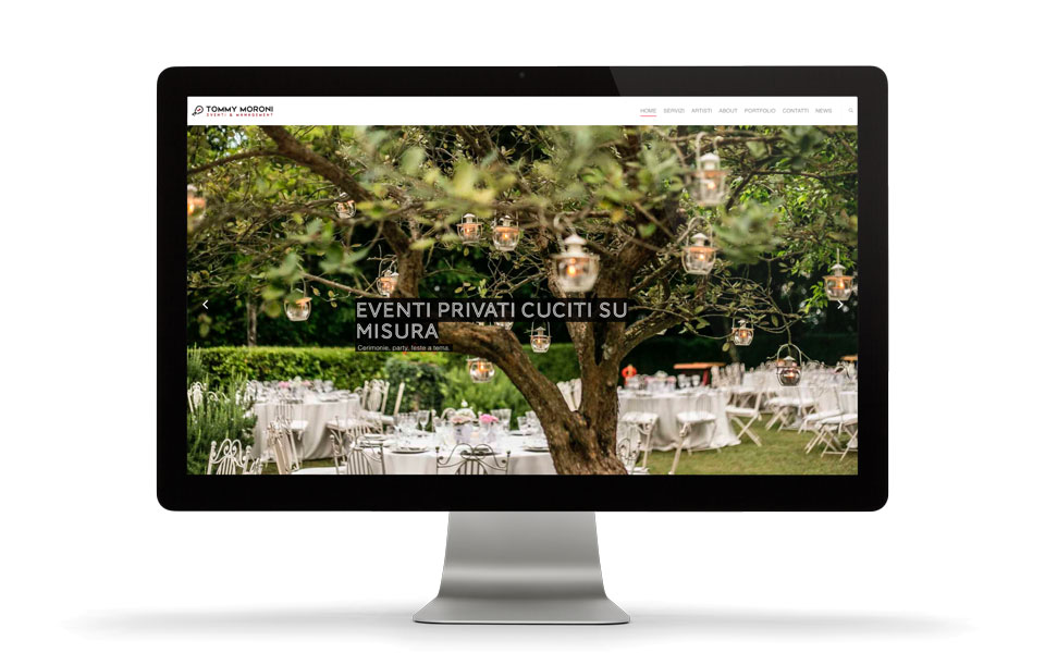
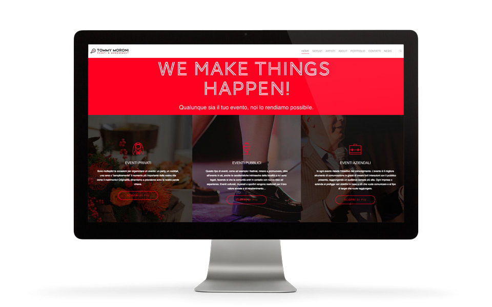
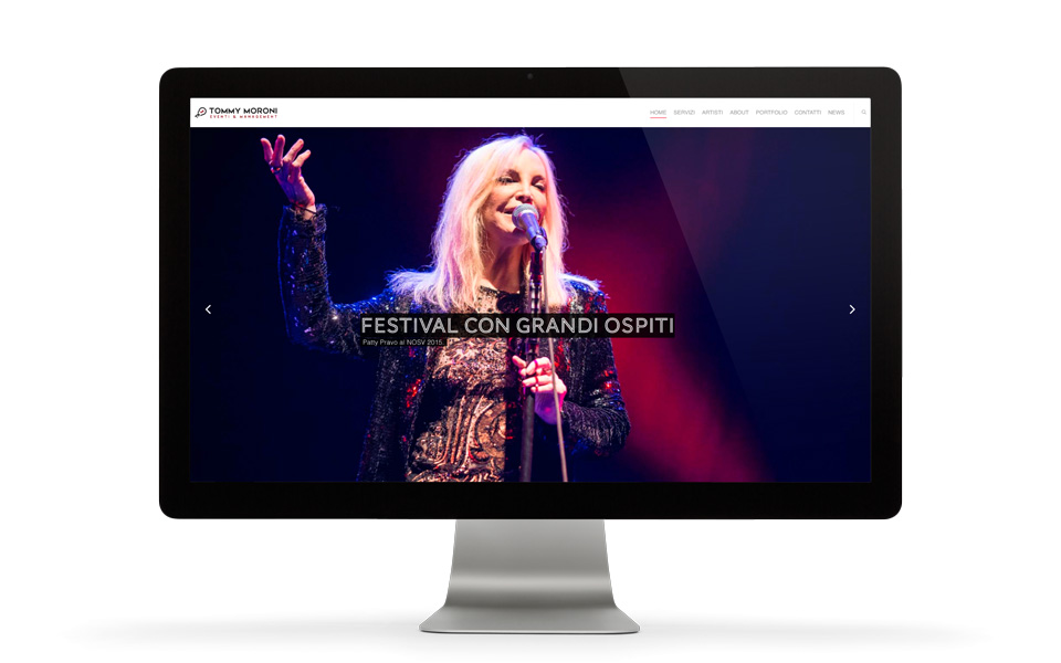
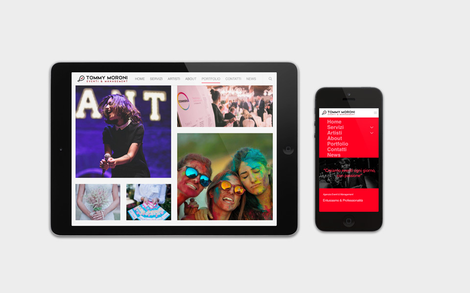
We were asked to redesign the stationery and create a new responsive website. The website needed to have excellent content organization to inform about the various services offered by the agency, while also having a strong visual impact—able to convey the atmosphere of the events organized and showcase the essence of the agency.
BRAND
DIGITAL
Solution
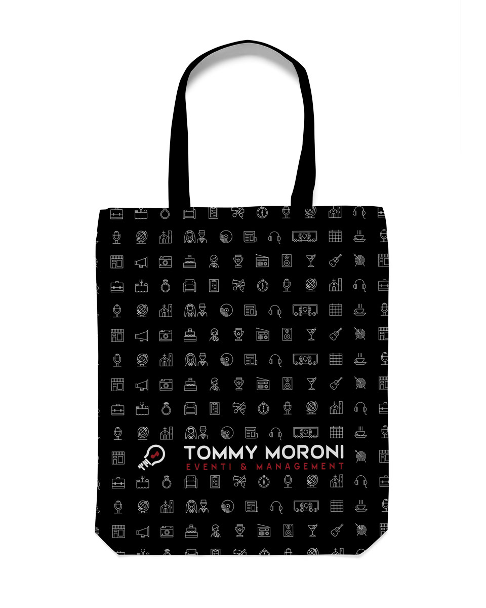
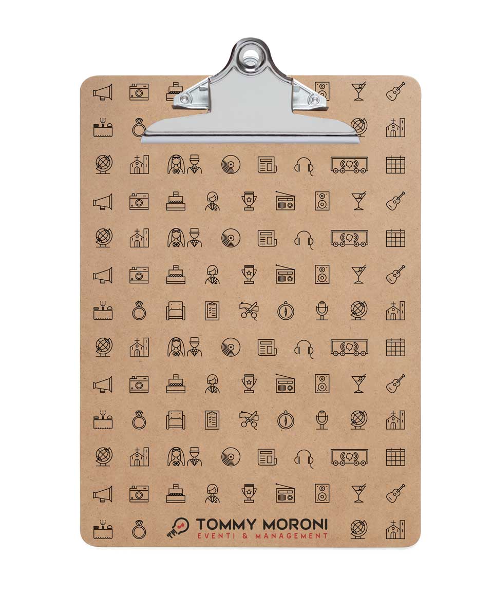
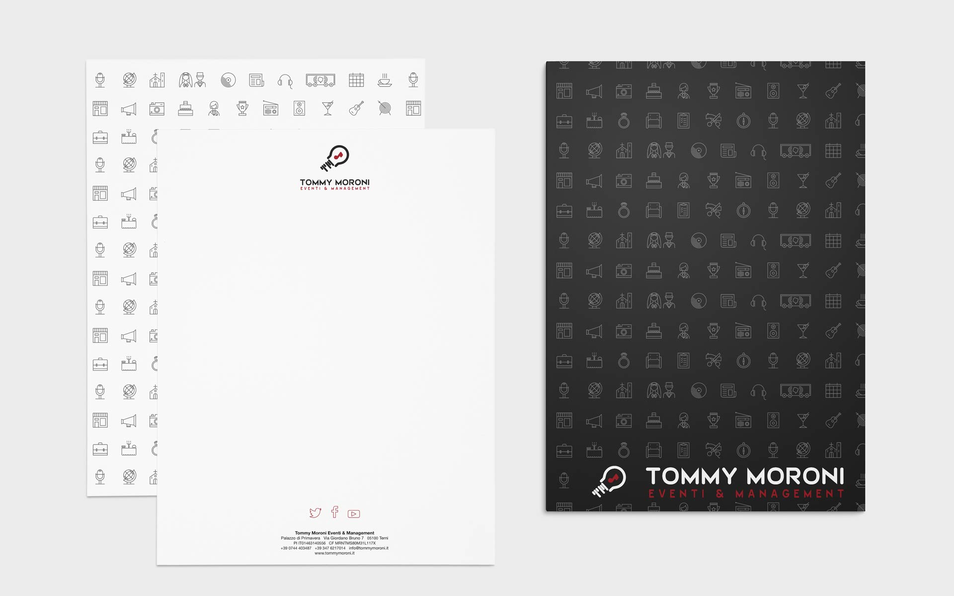
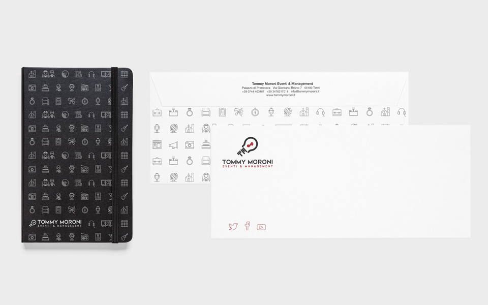
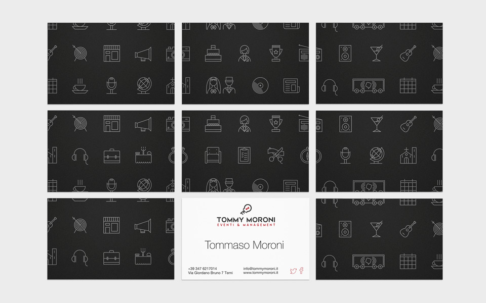
We created a set of icons that represent both the work the company does and its approach. The icons were designed on a square grid, arranged to fit into a single module or two, allowing for future expansion as the company grows.
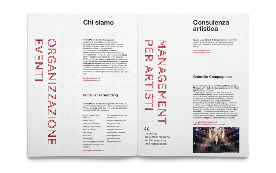
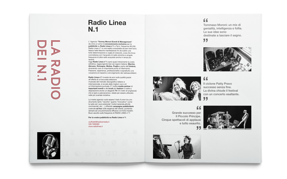
The elements of the stationery—letterhead, envelope, business card, and presentation folders—were created using the icon pattern that summarizes the services and characteristics of the agency.
While black and white continue to dominate the printed materials, we introduced a new color for the website: a vibrant red. This color, along with the burgundy already present in the company’s palette and white, was used to categorize the three types of events offered on the website: public, corporate, and private.
On the website, the icons are used in an animated form.
