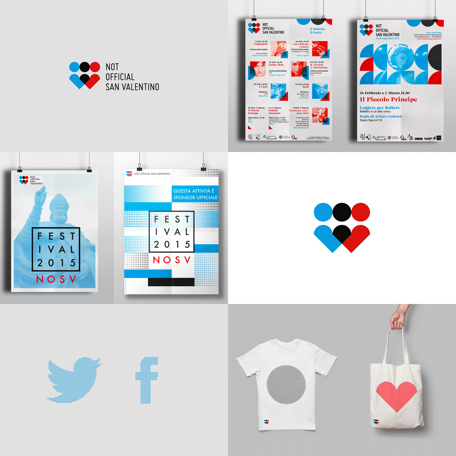
NOSV FESTIVAL
Brand identity for a cultural festival
Client
Not Official San Valentino is a festival of music, art, and dance. In 2014, after its third edition and growing popularity year after year, the organizers decided to give the festival a completely new graphic identity.Briefing
At the same time, there were many other events in Terni. We were tasked with creating a brand identity that would distinguish Not Official San Valentino as an independent festival and set it apart from the others.BRAND
DIGITAL
Rebrand 2014
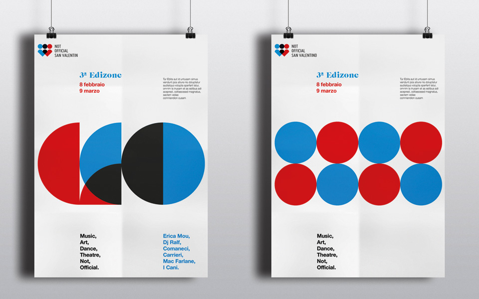
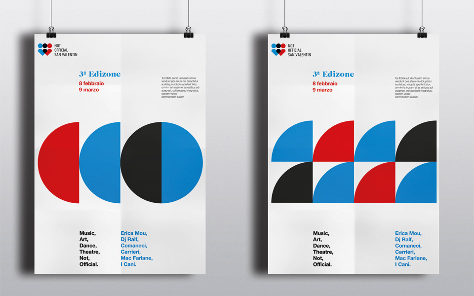
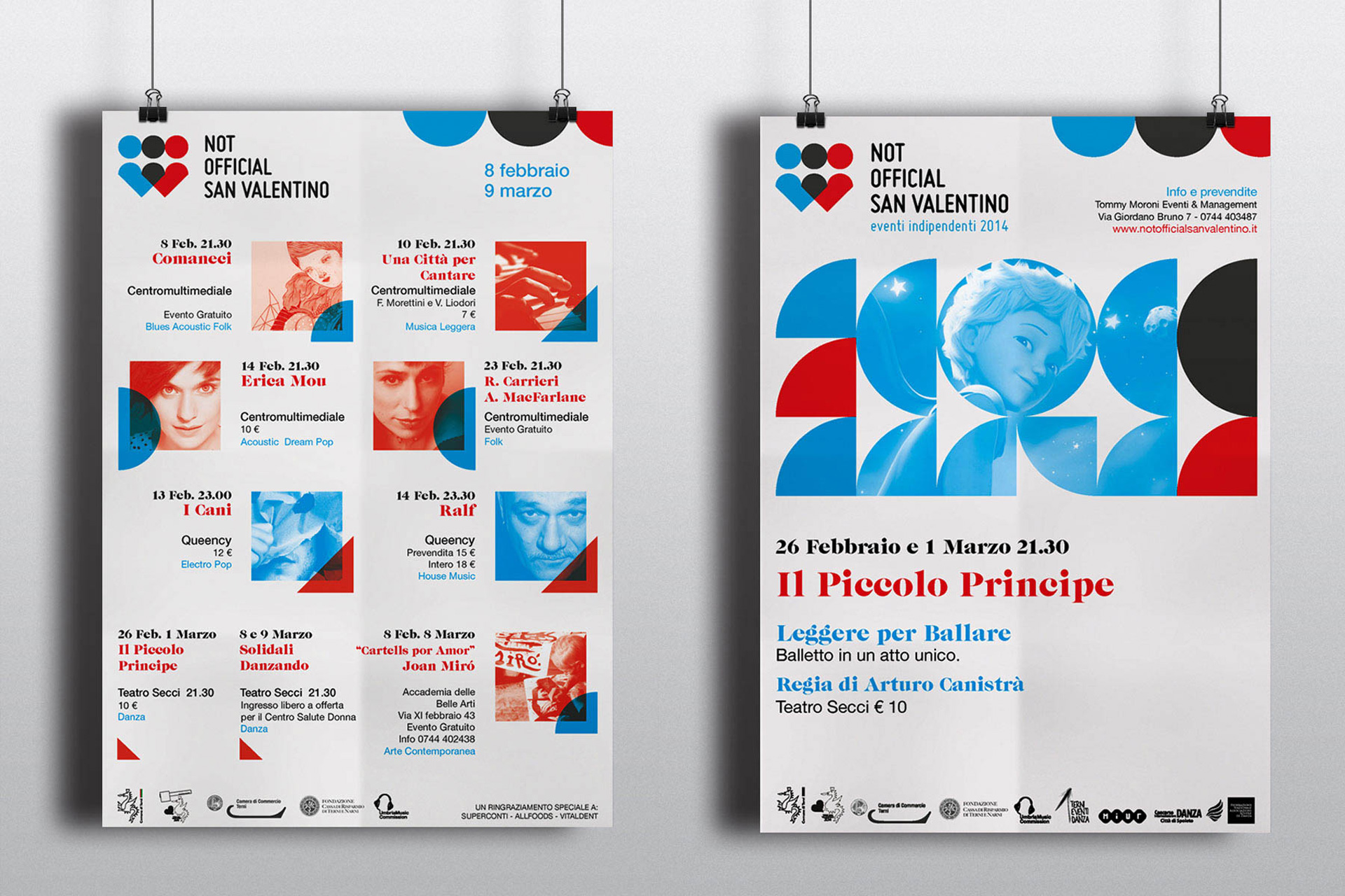
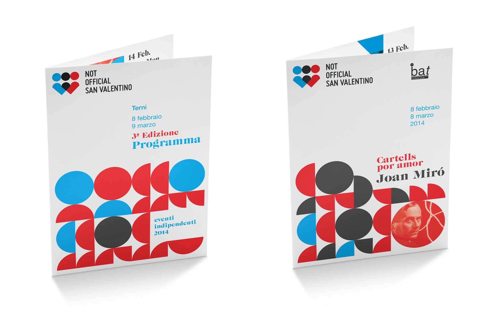
The previous logo consisted of three stylized “little figures” in the colors red, cyan, and black. Starting with these three colors, we decided to play with overlays—red and cyan shapes that, when layered during printing, create the third color, black, and consequently generate new shapes.
The two little figures, which overlap to form the third, and the two hearts that do the same, evoke the concept of “love” in its broadest sense. Two people, united by this emotion, support, strengthen, and enrich each other—essentially, 1+1 in this case equals 3.
The identity is completed by a series of modules, created by dividing the elements of the logo, which are then used to form patterns or to be layered over text and images.
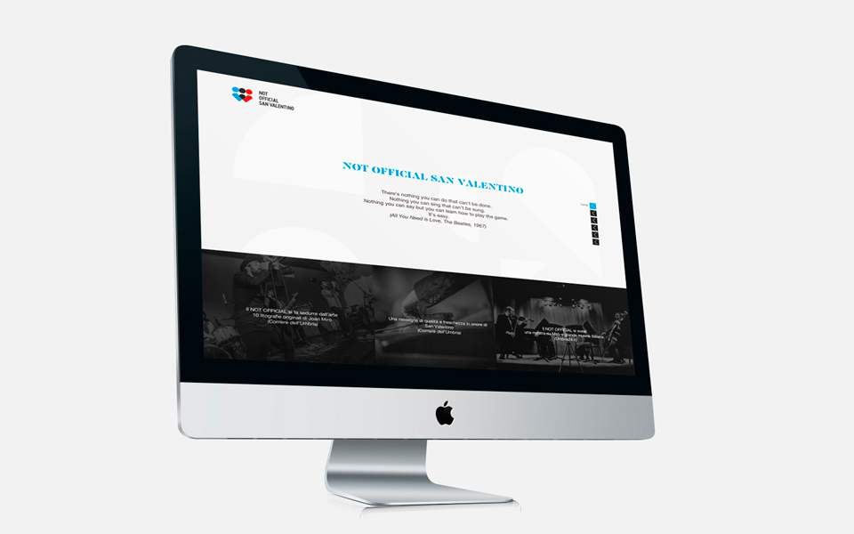
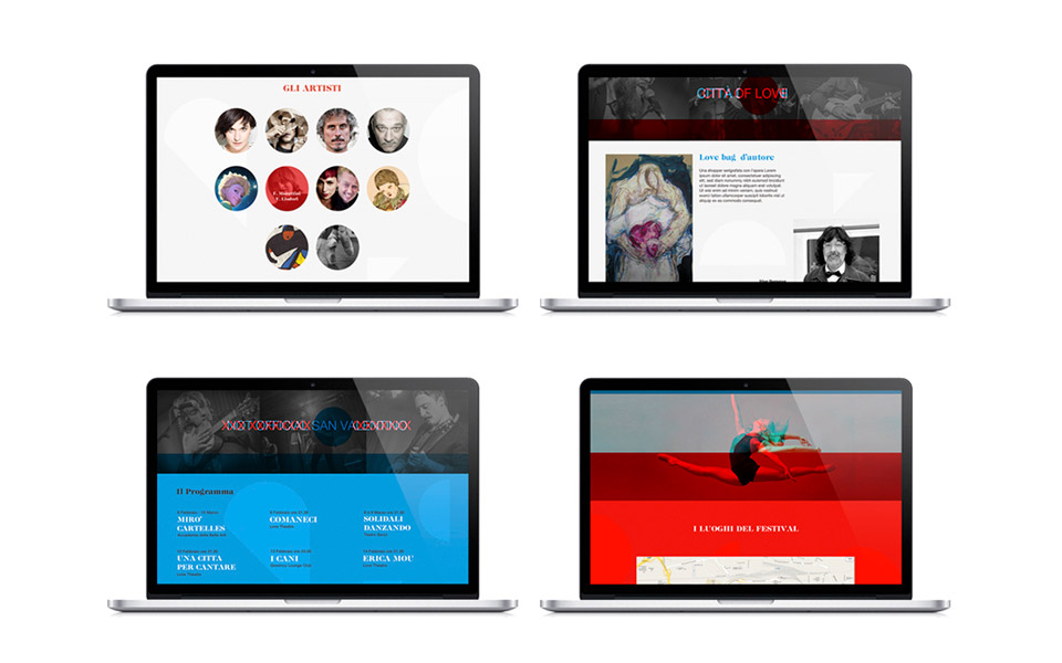
The use of red and cyan also allowed us to experiment with stereoscopic effects, creating a decoding game on the web. Phrases with different content and various photos are layered, then revealed individually through the use of red or cyan filters.
2015
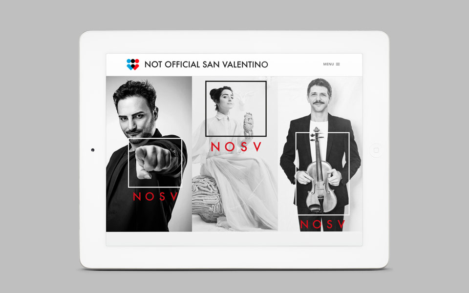
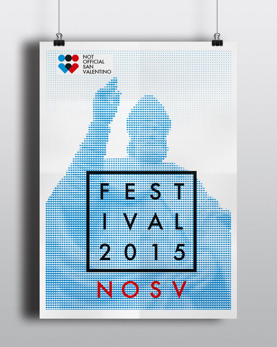
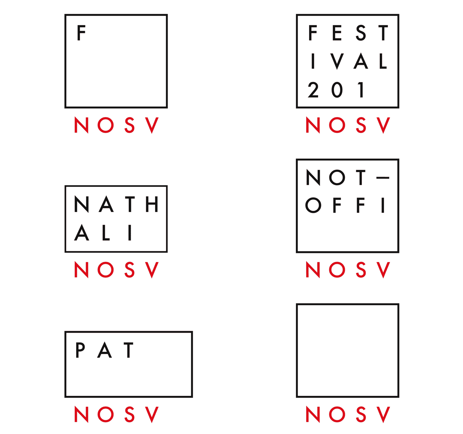
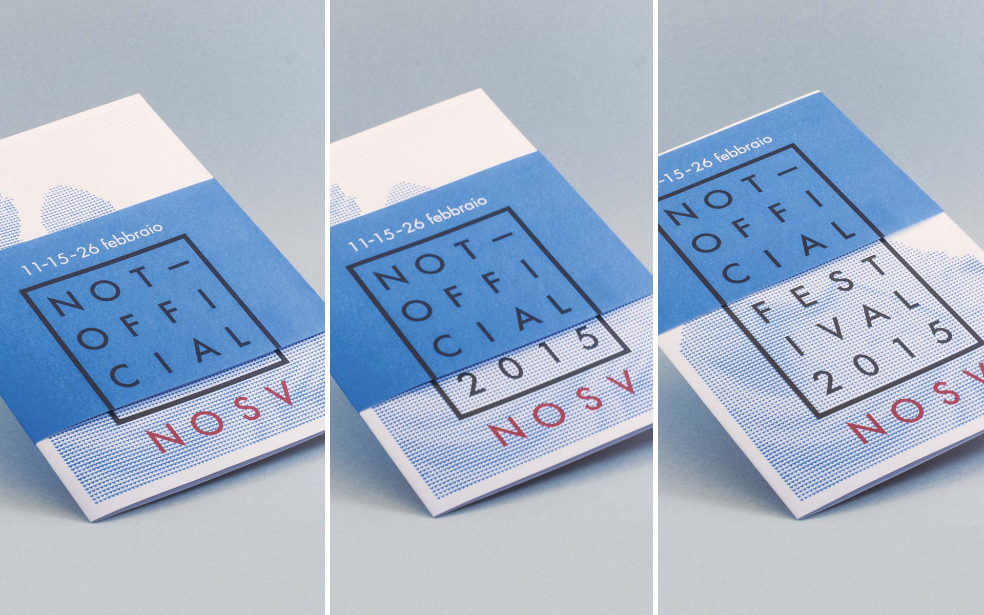
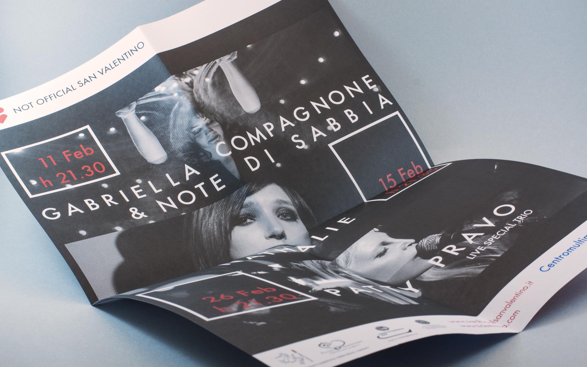
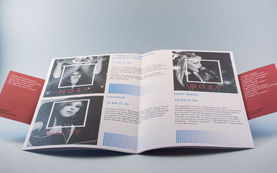
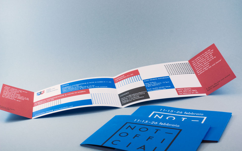
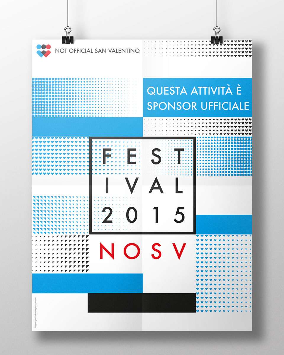
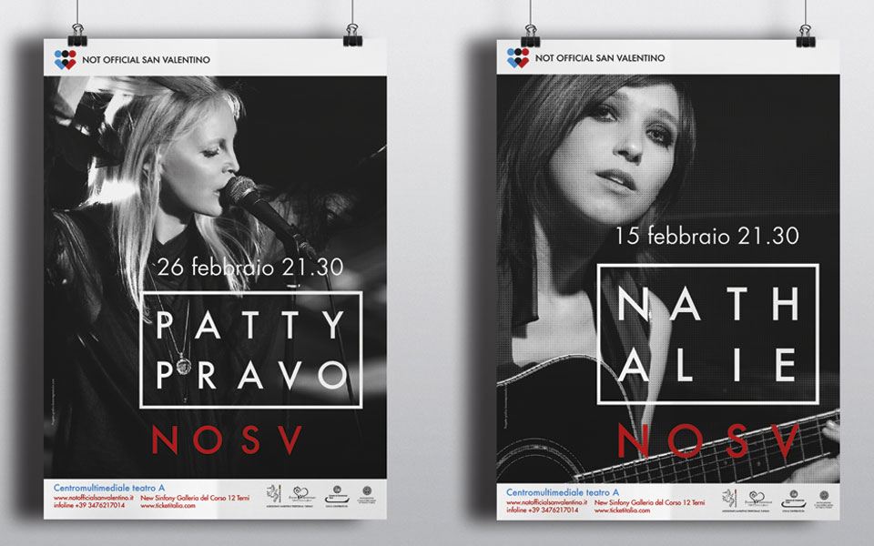
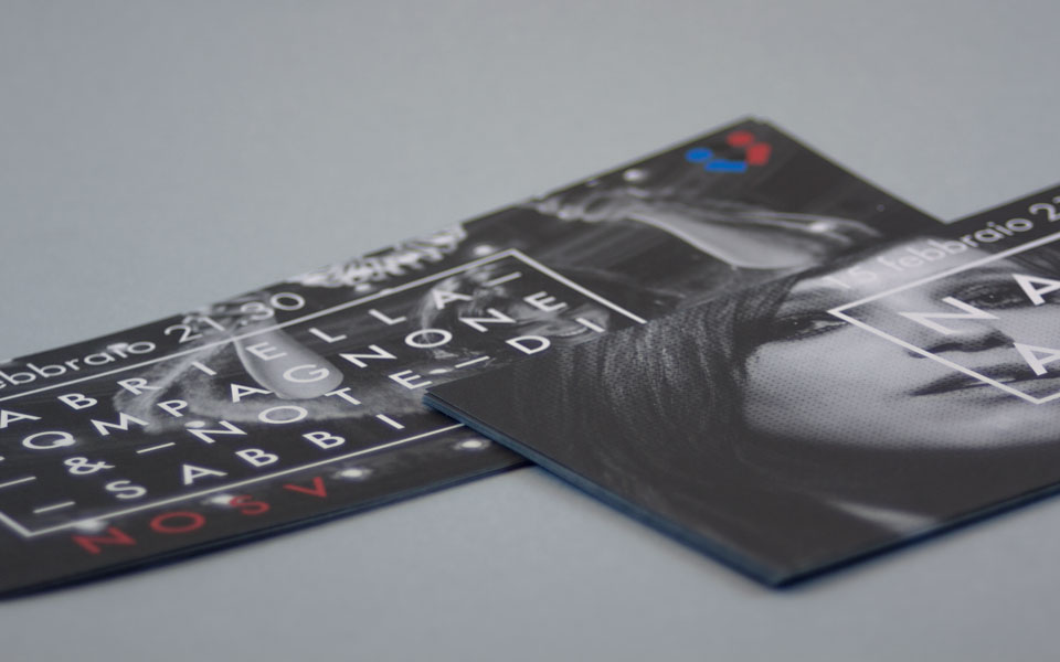
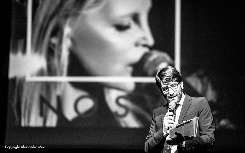
We saw the Not Official San Valentino festival as a container that brings together people, artists, and places. To convey this concept, we used the acronym NOSV as a fixed element, and a rectangle as a dynamic element, which was used to highlight images, text, and symbols, changing depending on its content. To illustrate this concept, we created a sleeve for the fold-out brochure, which, when slid across, altered the text inside the frame
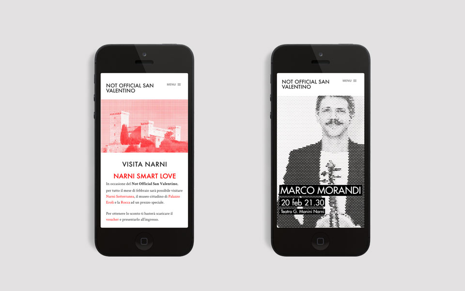
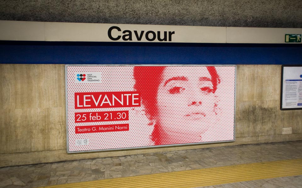
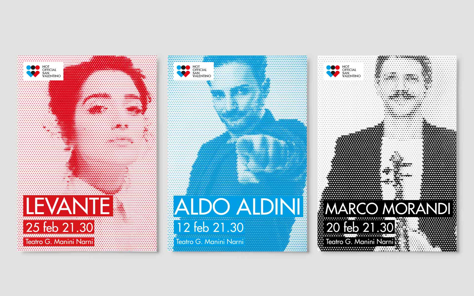
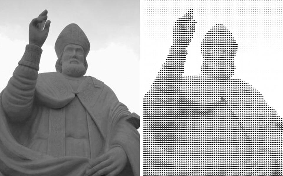
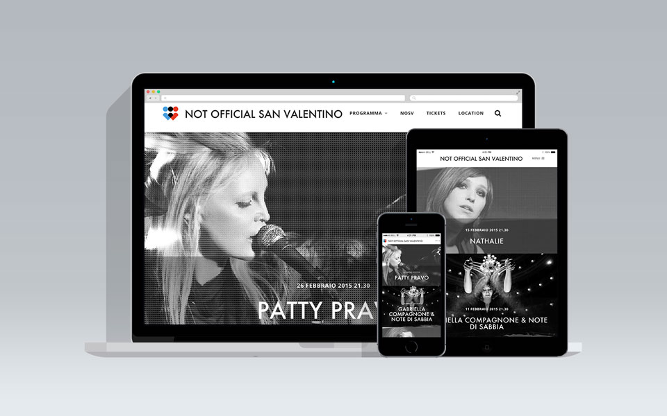
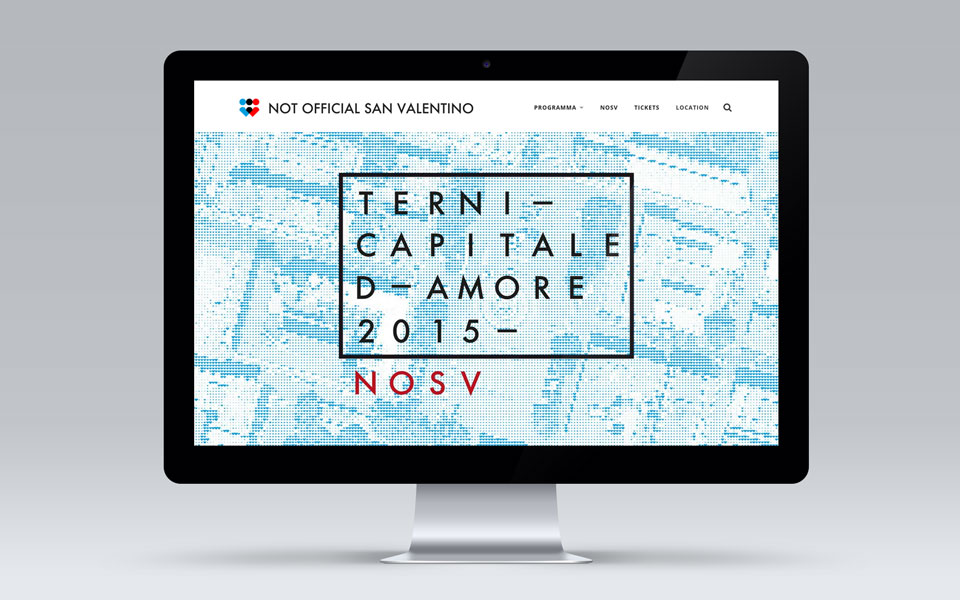
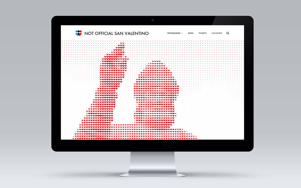
Each artist was associated with one of the modules that make up the festival logo (heart, triangle, circle). These modules were used to create halftone patterns, which could be used on their own, as in the case of San Valentino, layered over images, or used to create various patterns.
The visual communication was therefore very diverse, yet always consistent. The brand identity strongly defined the festival as an independent event and set it apart from the many other events happening concurrently on the calendar.
2016
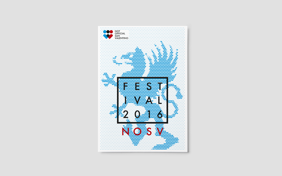
For the 2016 edition, the Not Official San Valentino festival moved to Narni. The festival’s visual identity needed to be refreshed to reflect this change, while still maintaining its recognizability.
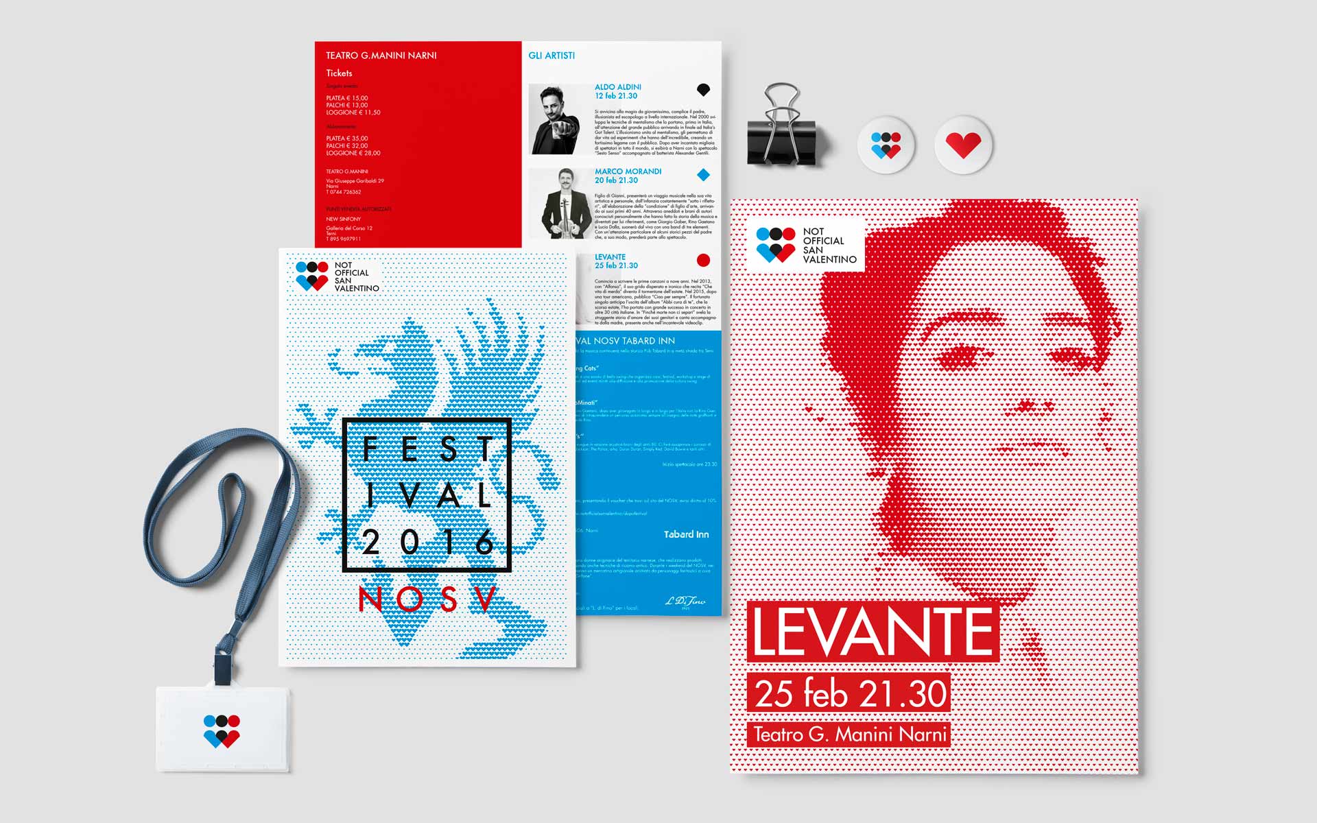
The graphic elements from the previous year, such as the rectangle with the NOSV acronym, as well as the images created with raster elements, were retained. Just as last year the image of San Valentino and, this year, the griffin symbol of the city of Narni were featured, in this edition, the images of the artists featured in the festival were also used in their fully rasterized version.
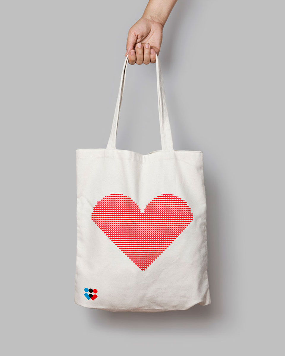
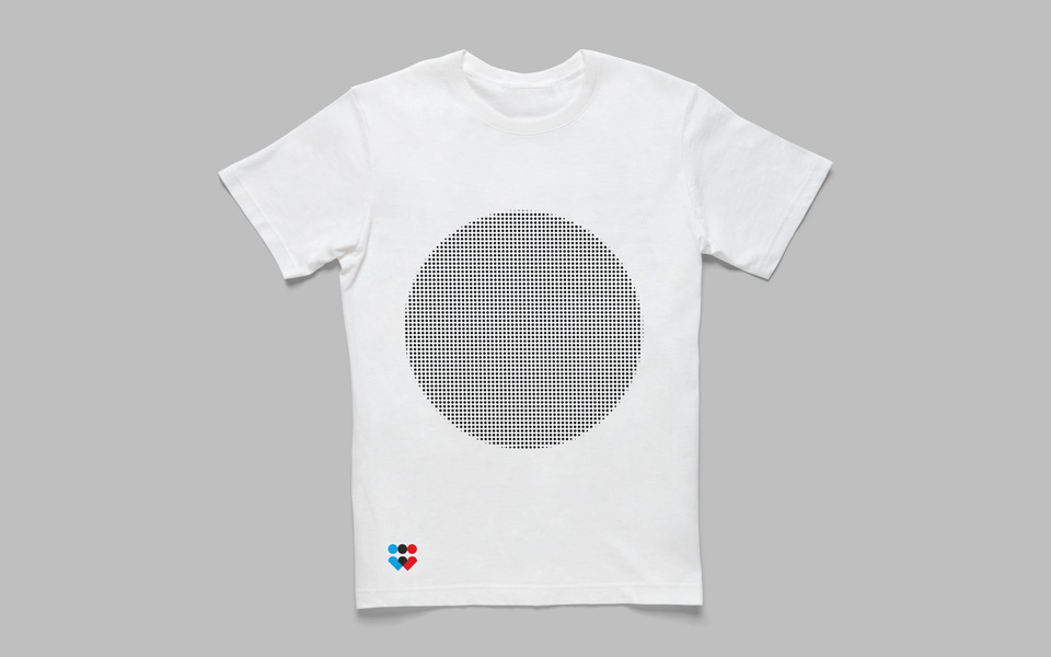
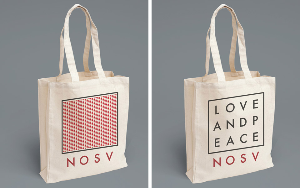
We created the halftone patterns using a single graphic element taken from the logo: the heart. This element has been used as an alternative to the logo itself in various applications, such as pins, tote bags, and t-shirts. Following the same principle, the icons for the different social networks were also designed.
