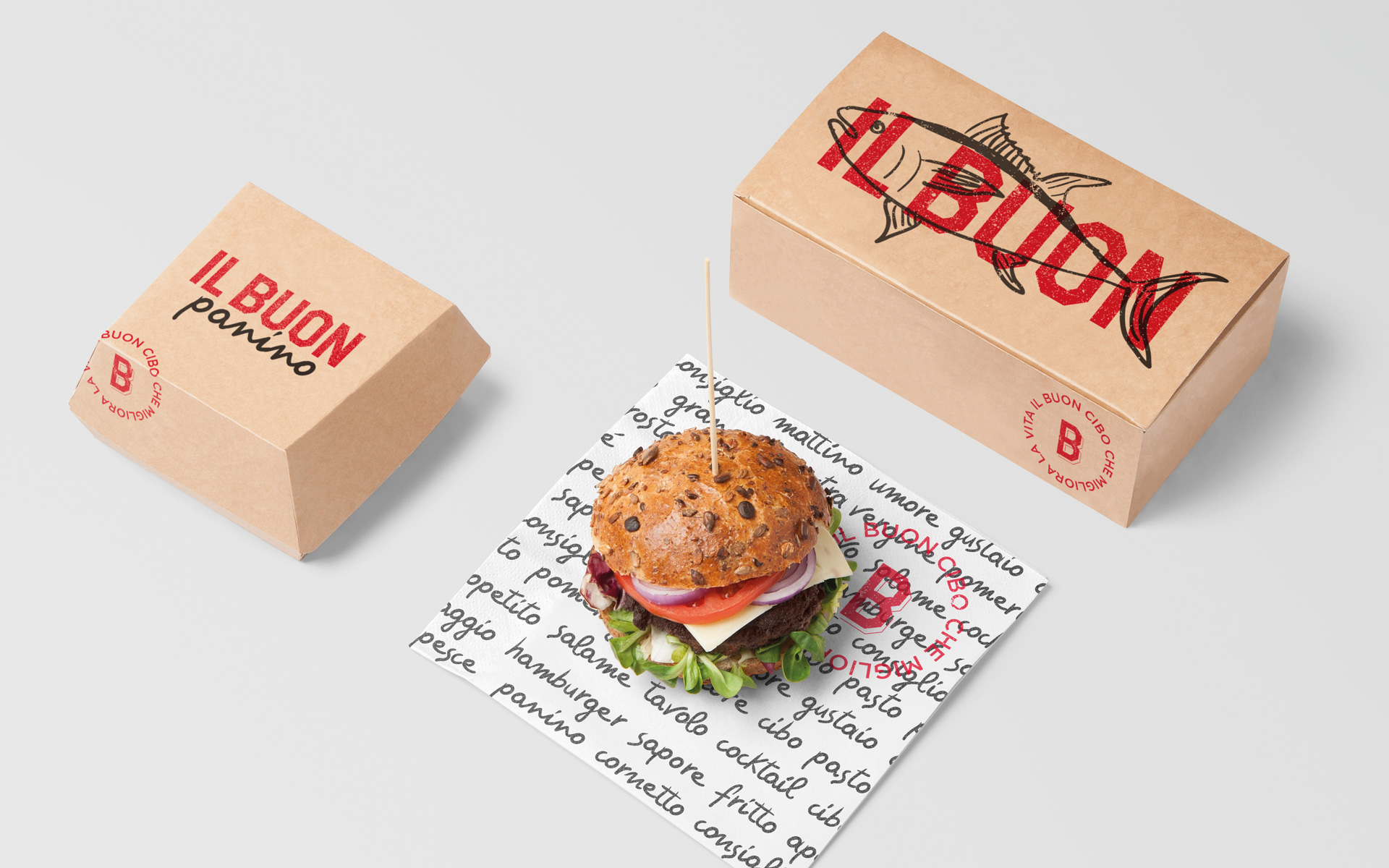
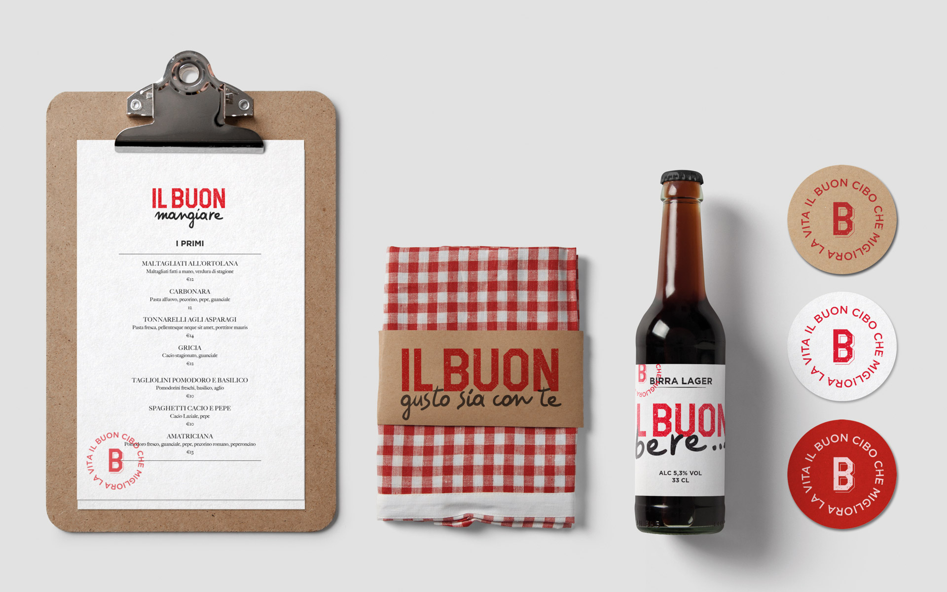
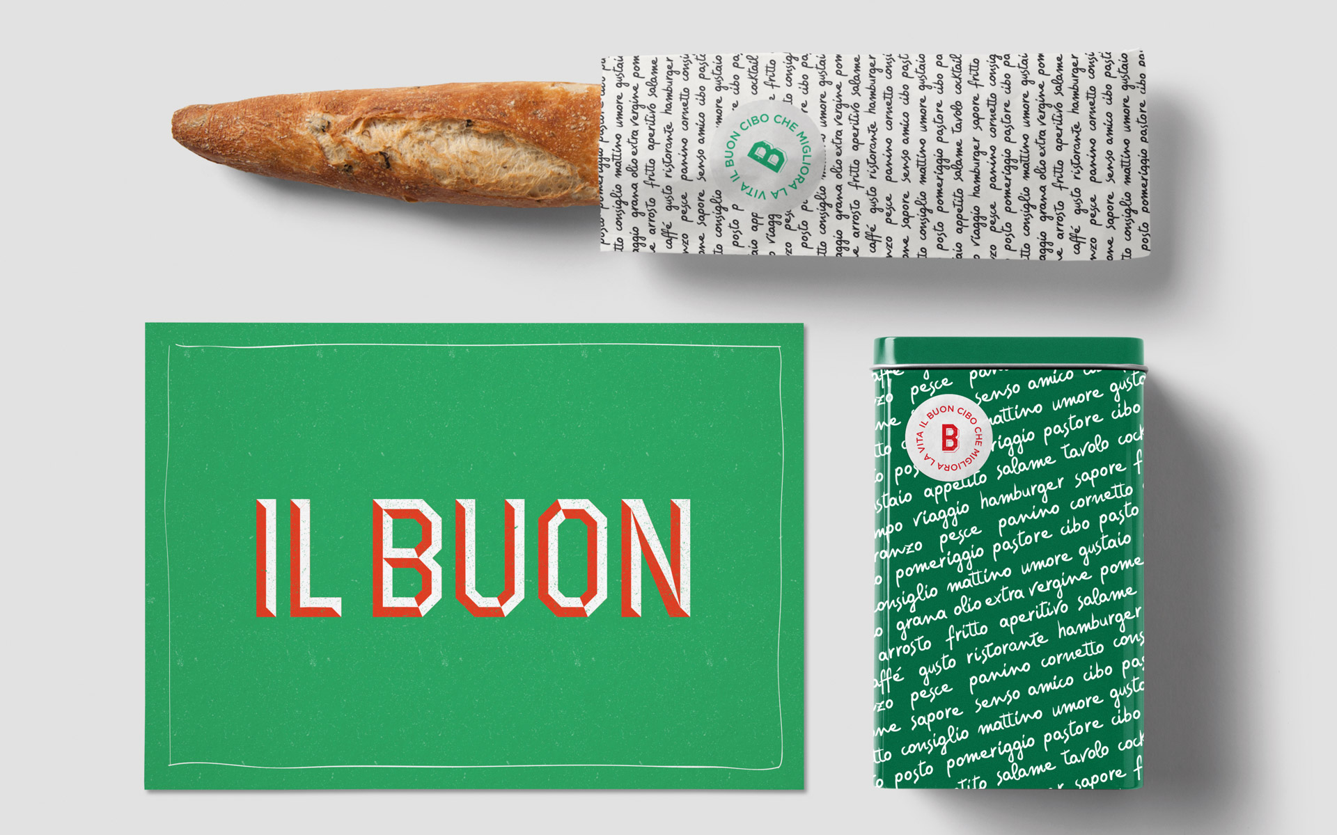
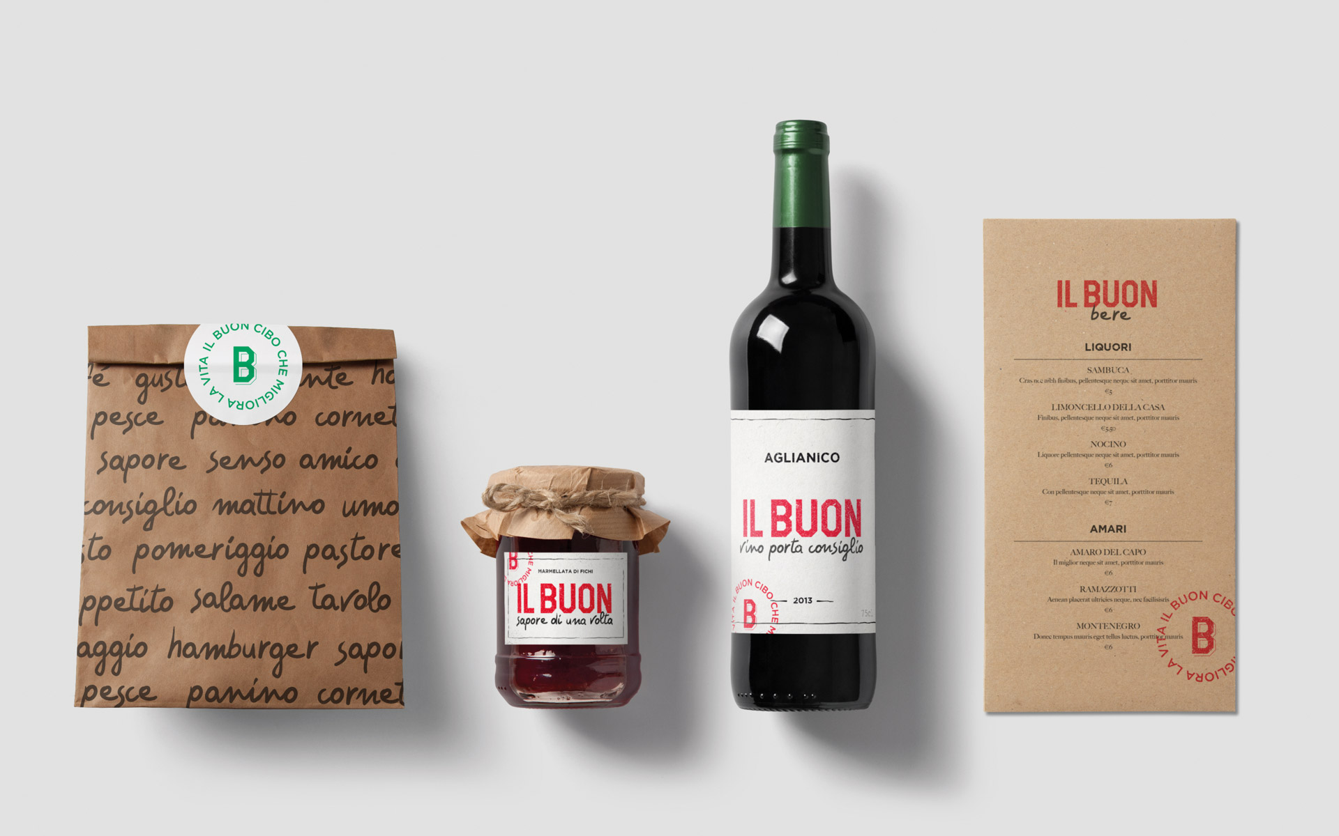
For the naming, we chose the Italian language. “Il Buon” evokes goodness in food, intentions, and trust. Adapted in various ways to highlight products and concepts, it is the absolute protagonist of the identity, as is the copy it generates.
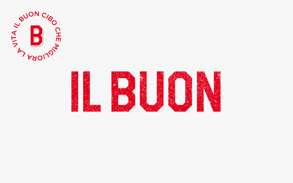
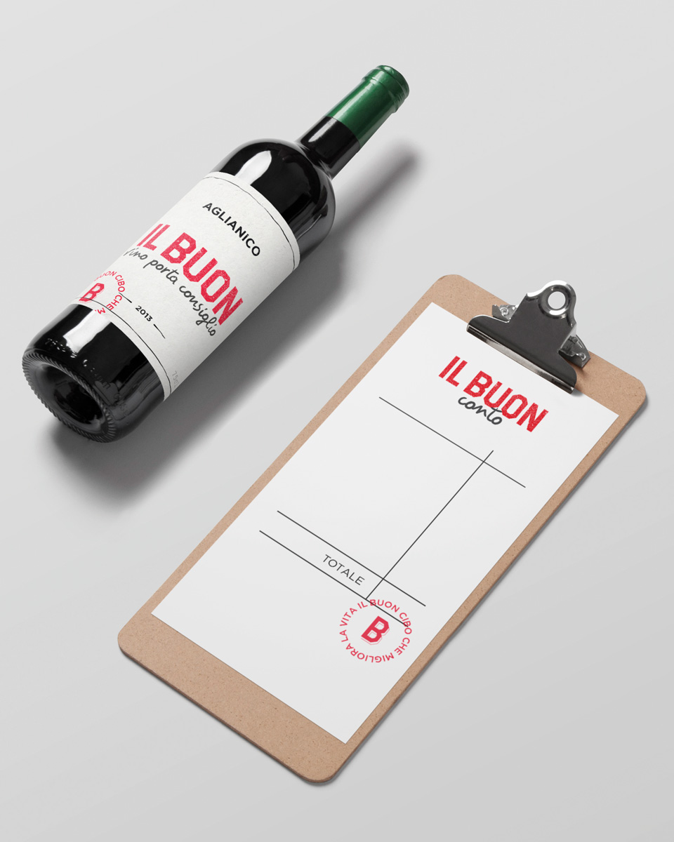
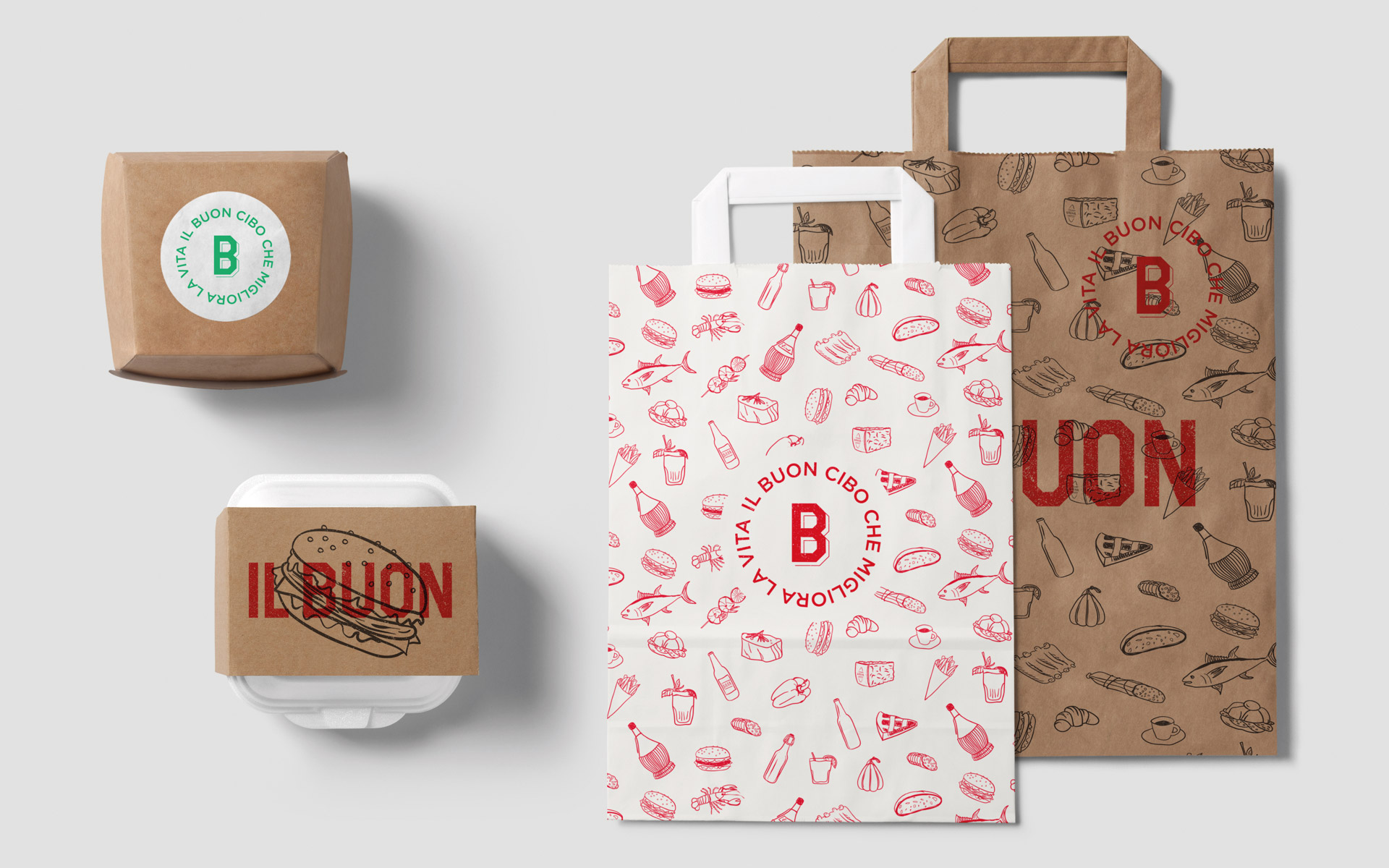
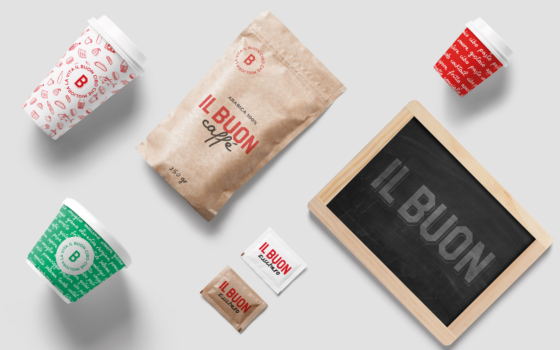
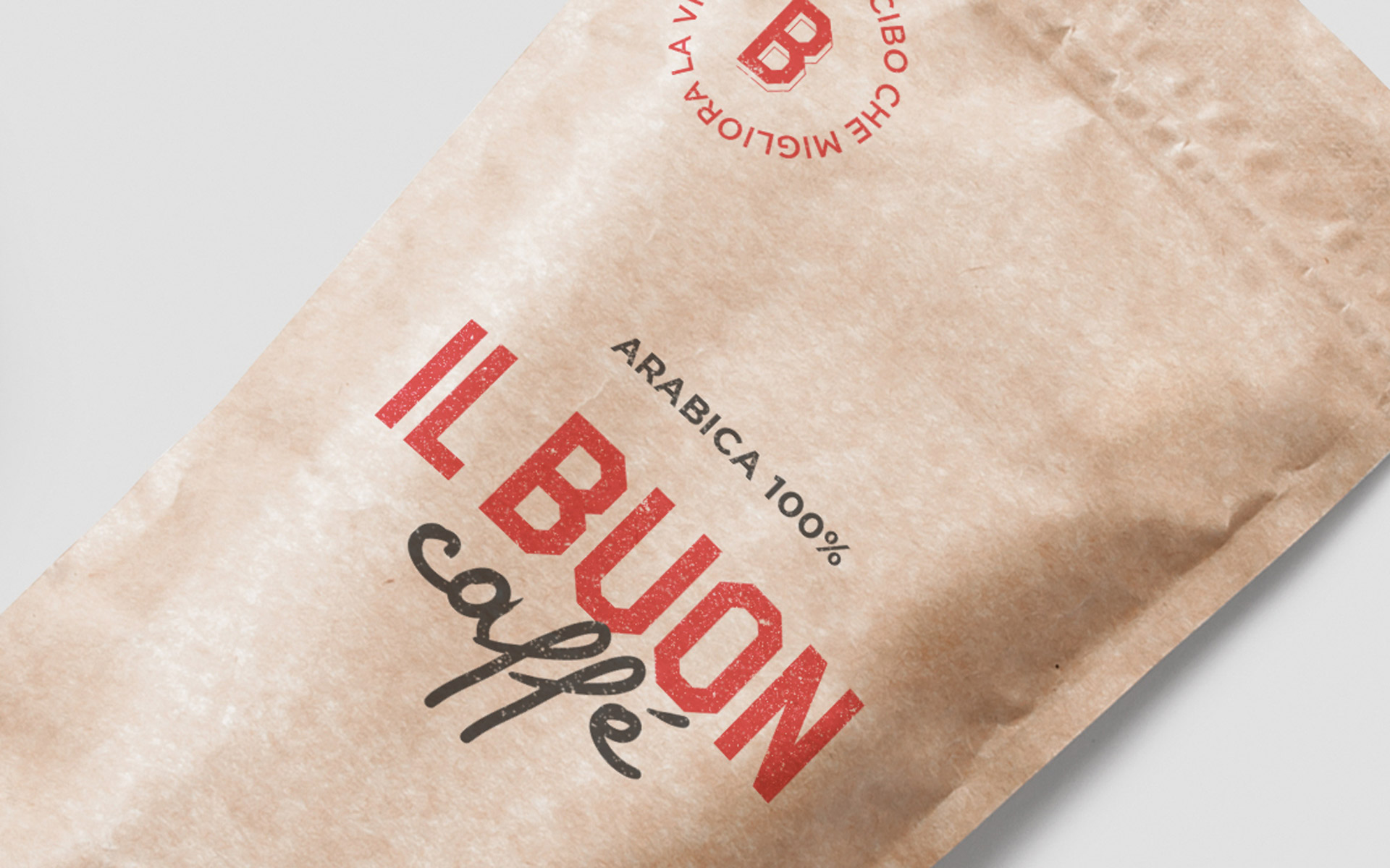
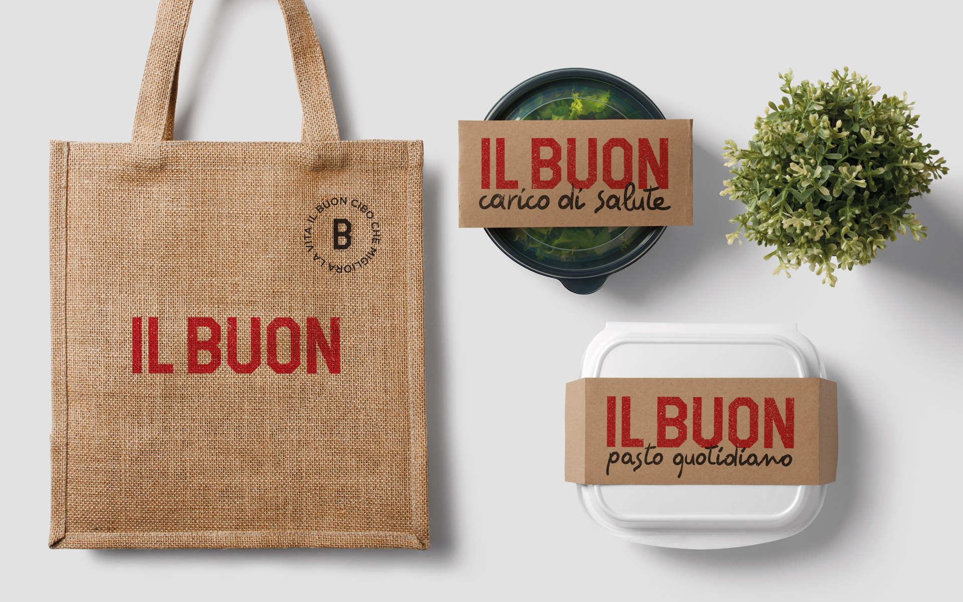
For the logotype, we drew inspiration from old Italian signs to characterize the visual identity both in terms of Italian heritage and tradition. The logo includes variations, which are primarily used when it also serves a decorative function. For the copy, we created a custom typeface, with letters hand-drawn and then digitized.
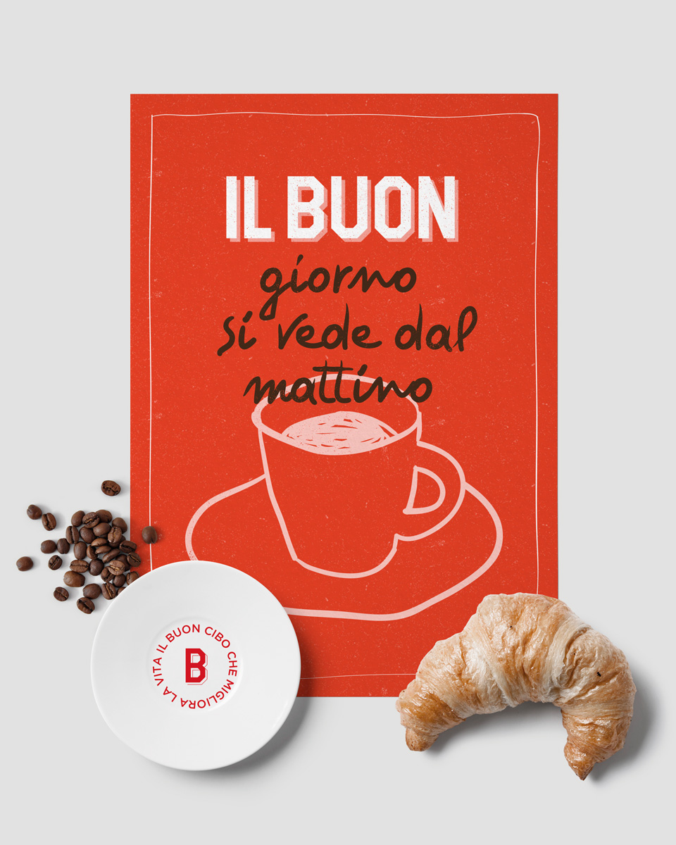
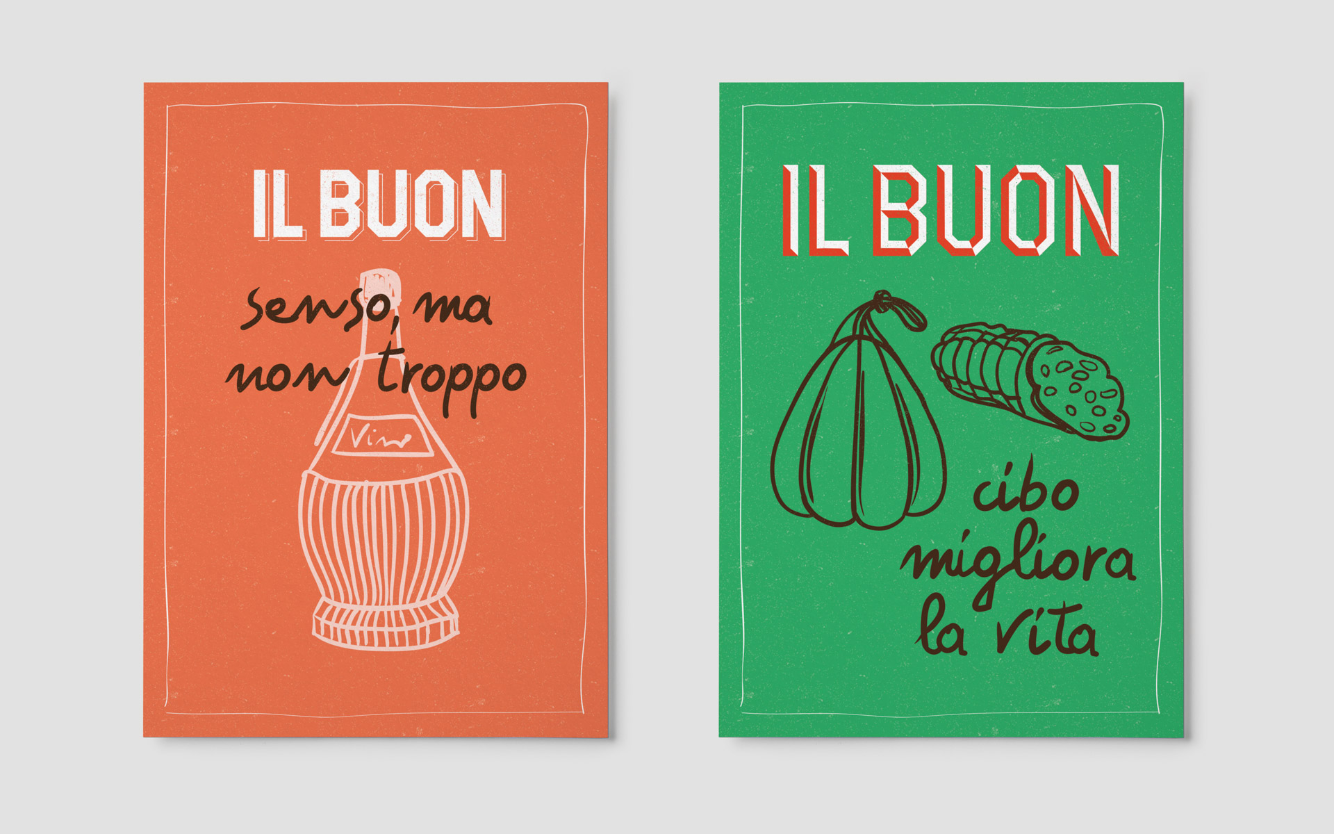
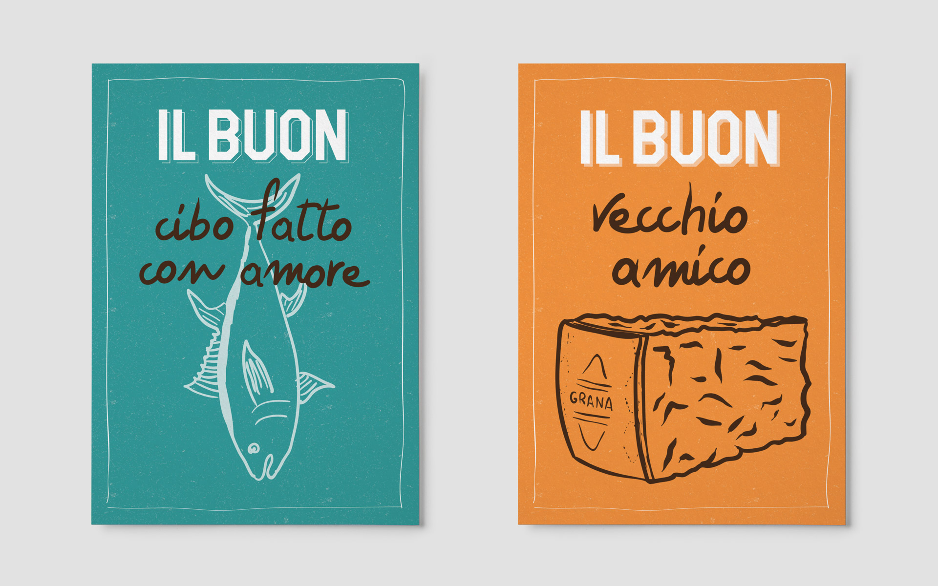
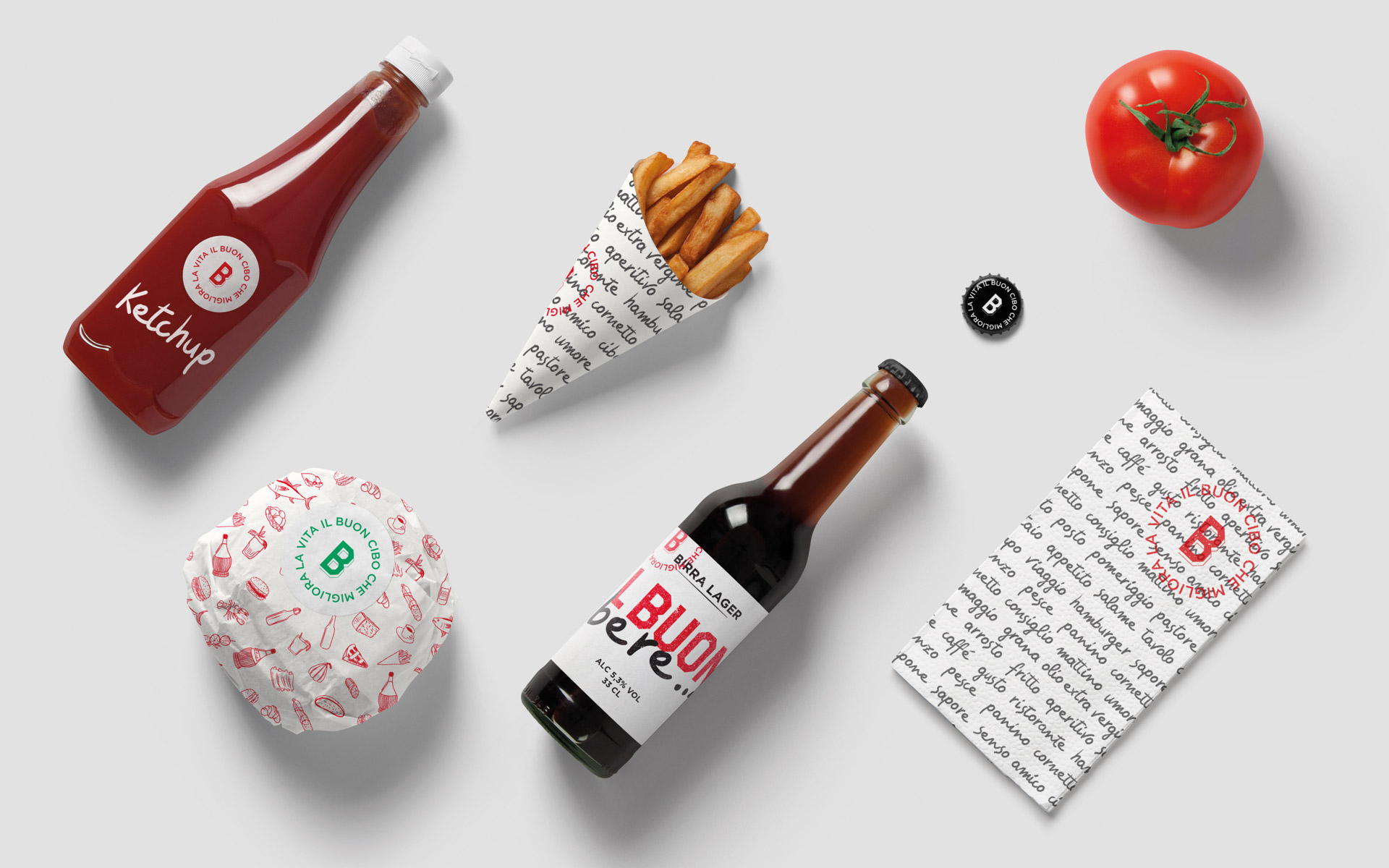
At the core of the branding proposal is the interaction between the visual and verbal identities, achieved through the combination of the logo (and thus the name of the venue) and, from time to time, the products, food items, and sayings.
This combination visually translates the two core aspects of the concept: the logo, with its “vintage” typography, represents tradition, while the handwritten, “instinctive,” and ever-changing copy reflects the intention to reinterpret and experiment.
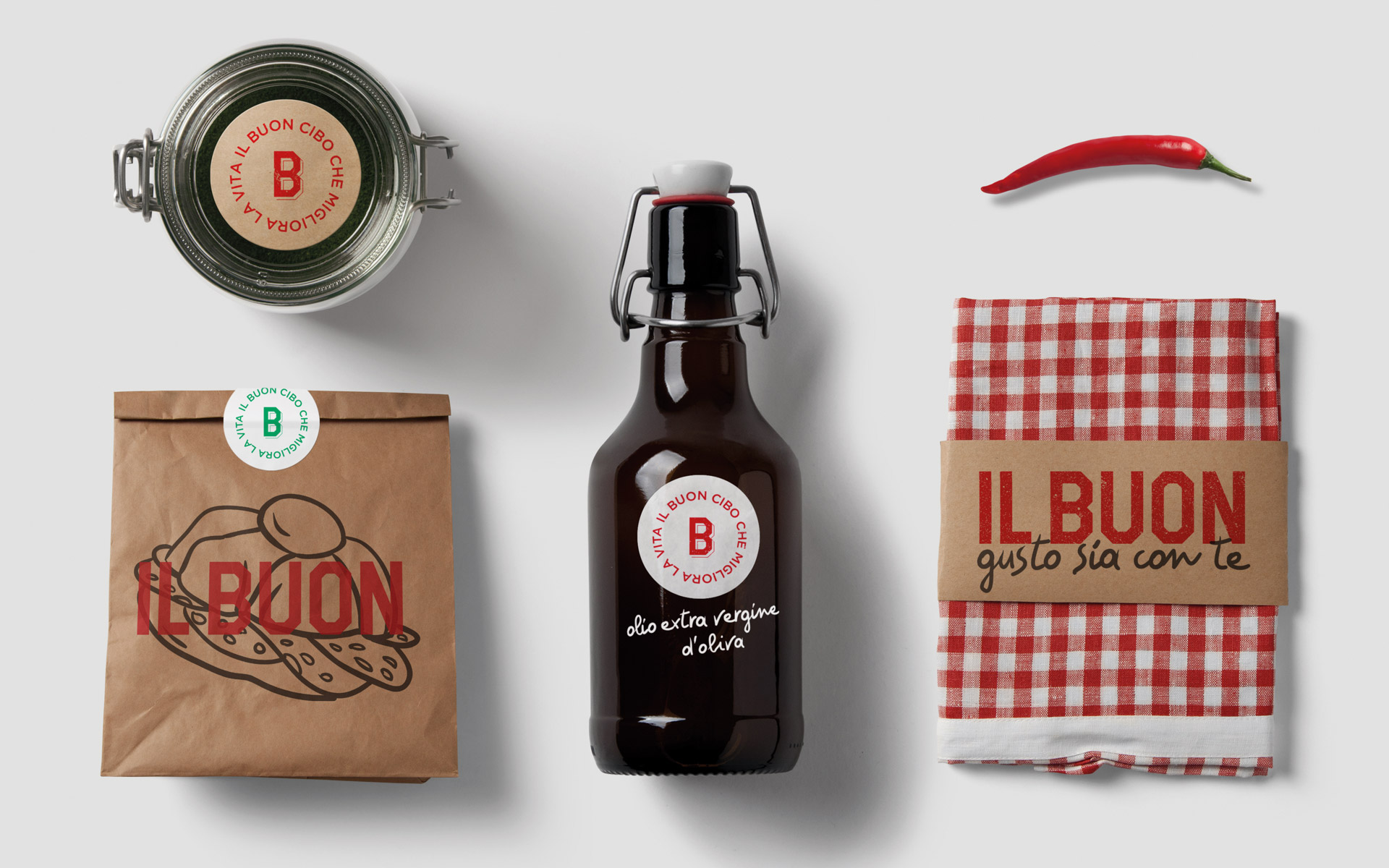
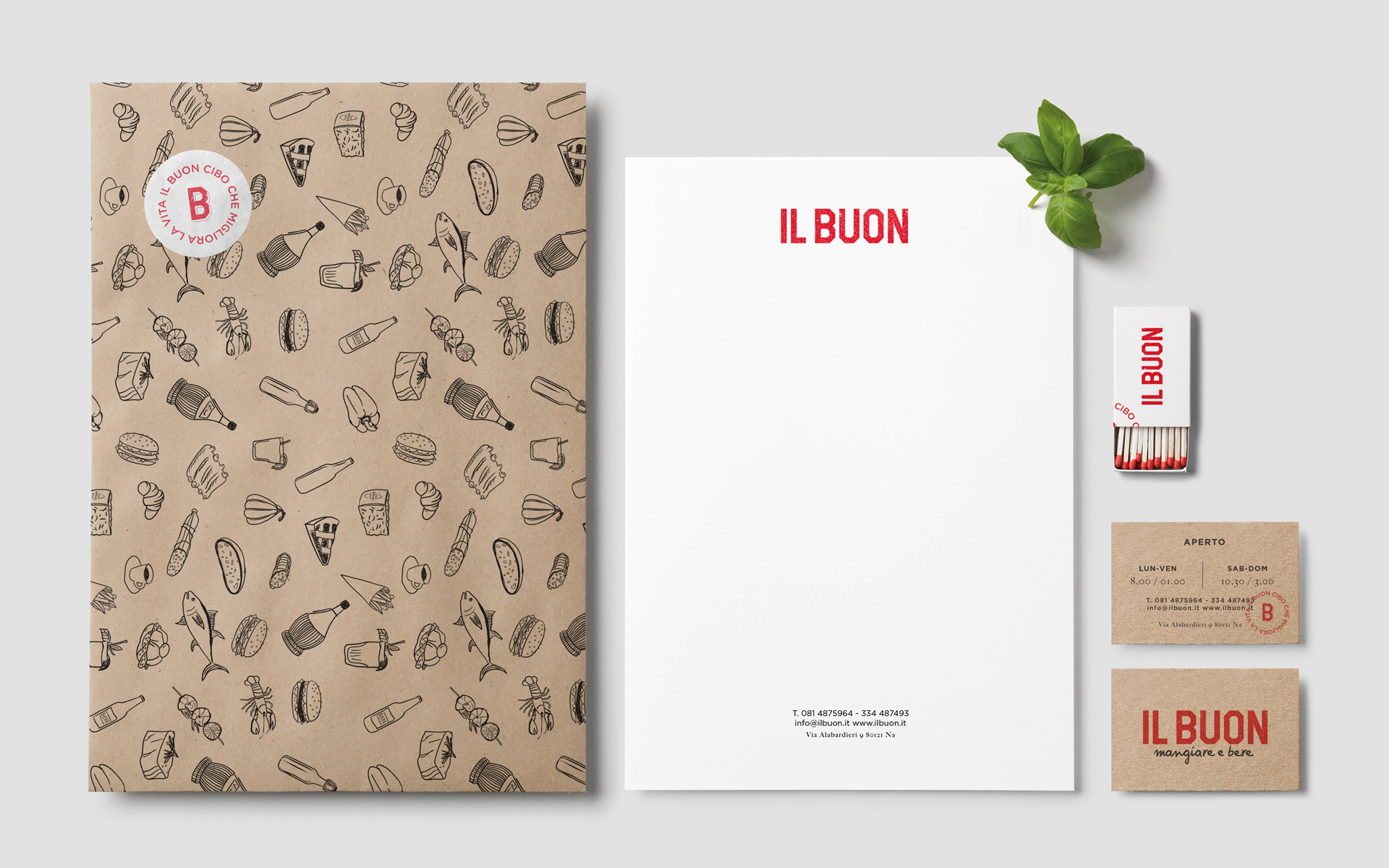
With the same function as the copy, illustrations can also be combined with the logo. These illustrations, also hand-drawn, align with the style of the font to maintain a cohesive visual language.
For the colors, we decided to draw inspiration freely from the colors of the Italian flag.
All right reserved / PI 01463340552
Privacy Settings
This website uses cookies to improve your experience while you navigate through the website.
View the Cookie Policy
Google Fonts is a service used to display font styles operated by Google Ireland Limited and serves to integrate such content into its pages.
Place of processing: Ireland - Privacy Policy
Gravatar is an image visualisation service provided by Automattic Inc. that allows this Website to incorporate content of this kind on its pages.
Place of processing: United States - Privacy Policy